To design custom Instagram highlight covers: (1) pick one accent colour and one icon style for all six covers; (2) design each 1080x1080 cover in Canva using free Instagram-highlight-cover templates; (3) on Instagram, long-press the highlight, tap Edit Highlight, and upload your custom cover. Five minutes per cover, zero design skills required, completely free.
⚡ Key takeaways
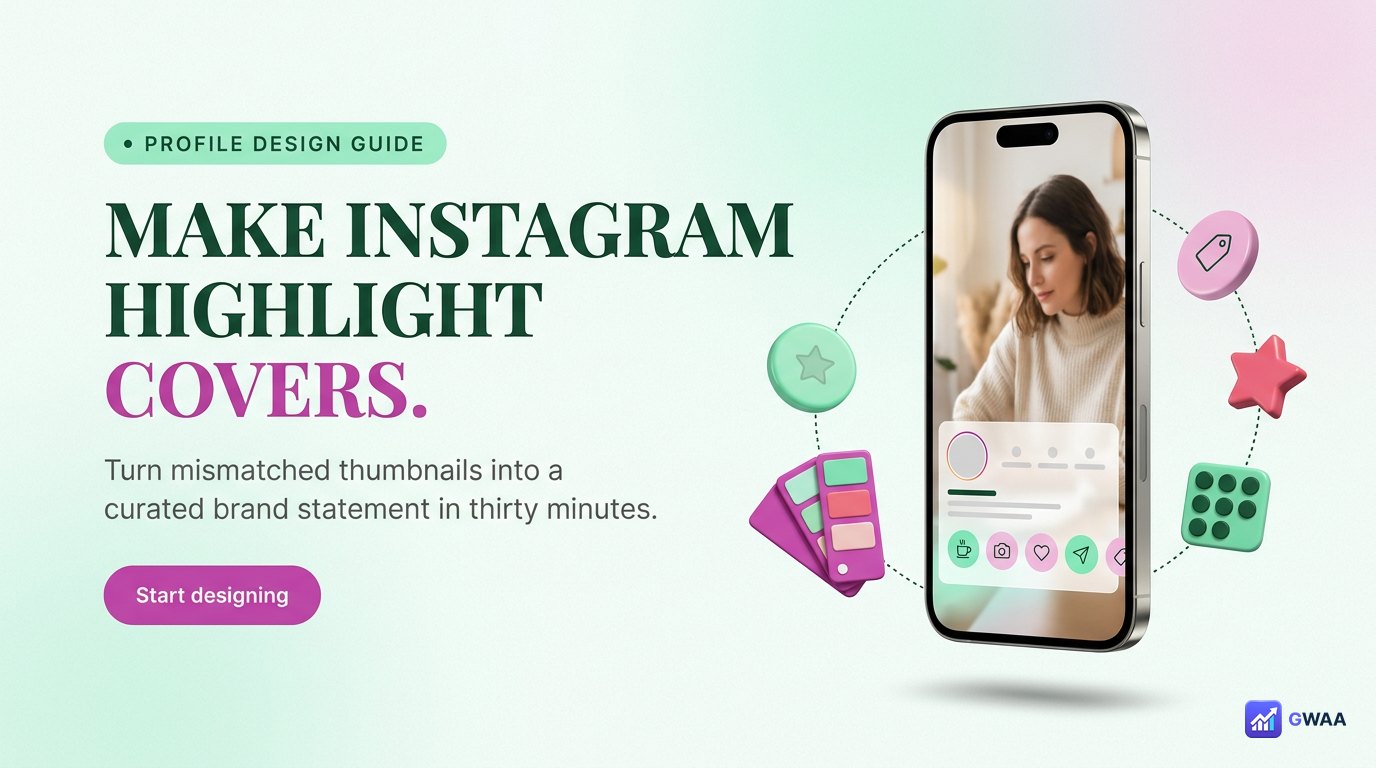
- Custom covers transform profile perception — from random thumbnails to curated portfolio in 30 minutes.
- Three style options: minimalist line icons, photo with light text overlay, or bold typography.
- Pick ONE palette and ONE icon style across all covers — consistency matters more than the specific choice.
- Canva is the easiest free tool with hundreds of pre-made Instagram-highlight-cover templates.
- Upload via long-press → Edit Highlight → pick custom cover. Three taps total inside Instagram.
Why highlight cover design quietly matters

Highlight covers are the second thing a new profile visitor sees, right after the bio. Six default thumbnails (random photos from the first story of each album) signal “this person uses Instagram”. Six designed covers with a matching palette signal “this person treats Instagram as a real channel”.
The difference is invisible to the algorithm but loud to humans. Brand accounts, creator accounts, freelancer portfolios, and small business profiles all benefit. Even personal accounts feel more intentional with designed covers.
The total cost: 30 minutes once, then nothing. The total benefit: every new visitor sees a more professional profile, indefinitely. Few profile-improvement moves have a better return for time invested.
Three style options — pick one and stick to it

Every successful highlight cover set uses one of three styles consistently:
- Minimalist icons. Single-line icons on a cream or pastel background. Works for any niche, looks clean at 60px (Instagram’s display size for covers). The safest default.
- Photo with light text overlay. A portrait or scenic photo, slightly desaturated, with a single word in white centred on top. Best for travel, food, fitness creators where the photo itself tells the story.
- Bold typography. A single word in a chunky display font on a coloured background. Works for editorial, opinion, or text-driven profiles where words are the brand.
The trap to avoid: mixing two styles in the same row. A profile with three icon covers and three photo covers feels chaotic, even if each individual cover is well-designed. Pick one style for all six and don’t deviate.
Three steps from template to live cover
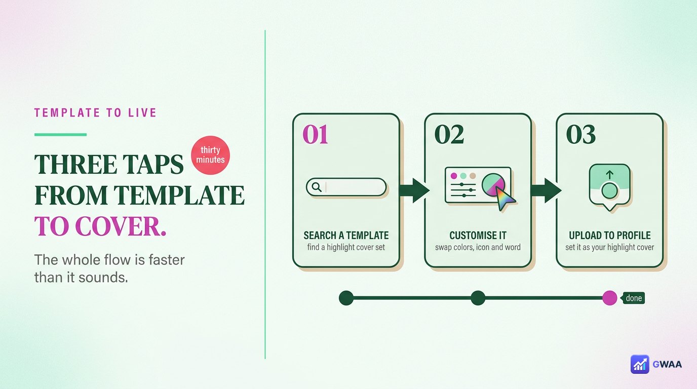
The end-to-end flow is faster than it sounds:
- Open Canva (free, web or app). Search “Instagram highlight cover”. Hundreds of templates appear.
- Pick a template that matches your chosen style. Customise the colour to match your palette, swap the icon for the one you want, save the design.
- Upload the saved image as a highlight cover on Instagram: long-press the highlight, tap Edit Highlight, tap Edit Cover, pick the new image from your gallery.
The whole flow is under five minutes per cover once you’ve done one. The first cover takes longer because you’re settling on your palette and icon style; subsequent covers are template-tweaks.
Canva is the easiest free tool
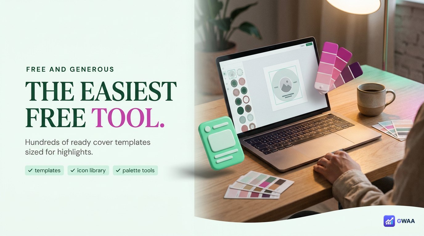
Canva is the dominant tool for highlight cover design because the free tier is genuinely generous: hundreds of pre-built templates specifically sized 1080x1080 for Instagram highlight covers, plus icon libraries, font libraries, and colour palette tools.
Alternatives exist (Adobe Express, Figma, Photoshop) but they’re overkill for this task. Canva is purpose-built for social media graphics and the workflow takes minutes per cover. If you already use Canva for other social content, the highlight covers feel like a natural extension.
Important: the free Canva tier covers everything you need for highlight covers. The Pro tier adds nice-to-haves (background removal, brand kits) but isn’t required.
Palette choice — one colour, used consistently

The single biggest predictor of whether a cover set looks professional: palette consistency. Six covers in matching tones feels curated. Six covers in different colours feels random, no matter how well-designed each is individually.
Five palettes that work for most profiles:
- Warm amber: golden tones, works for travel, food, lifestyle, vintage aesthetics.
- Cool teal: blue-green tones, works for tech, wellness, modern minimalist brands.
- Muted rose: dusty pinks, works for beauty, fashion, soft lifestyle.
- Olive green: earthy tones, works for outdoor, fitness, sustainability.
- Dusty lavender: soft purples, works for creative, art, journaling profiles.
Pick one. Use it for the icon stroke colour (if minimalist style), the text colour (if photo style), or the background colour (if typographic style). All six covers in the row should share the same accent — that’s the entire trick.
Icon consistency beats icon choice
If you’re going with minimalist icons, the choice of specific icon matters less than the visual consistency:
- Same line weight. All icons drawn with the same thickness of stroke. Mixing thin and thick lines looks accidental.
- Same style. All outline-only, or all filled. Don’t mix.
- Same fill rule. If your icons have any filled areas, they all should — or none should.
- Same proportion. All icons sized so they occupy roughly the same area of the 1080x1080 canvas. Don’t let one icon dominate while another disappears.
Canva’s built-in icon library has pre-grouped sets that already follow these rules. Pick one set and use only icons from that set across all six covers — consistency comes free.
Typography — clean lowercase beats shouty caps

If you’re using typography (either in the typographic style or as labels on photos), choose carefully. At Instagram’s display size of 60px per cover, text legibility is challenging:
- Lowercase reads better than uppercase. Lowercase letters have varied shapes (ascenders, descenders) that the eye recognises faster than uniform-height caps.
- Sans-serif beats serif. Serifs collapse into noise at 60px.
- One word per cover, maximum two. Anything longer is unreadable. “Travel” works; “Adventures abroad” doesn’t.
- Medium weight, not heavy or thin. Heavy fonts feel shouty at small sizes; thin fonts disappear.
Default to clean sans-serif fonts in lowercase, single word, medium weight. The covers feel calmer and read more easily.
Uploading a custom cover — three taps inside Instagram

Once your cover is saved to your phone’s gallery, uploading it to Instagram is straightforward:
- Long-press the highlight on your profile that you want to change.
- Tap Edit Highlight in the popup menu.
- Tap Edit Cover, then choose between “Choose from gallery” (select your custom design) or use one of the stories already in the album.
Save. The cover updates immediately on your profile. Repeat for each of the six highlights you want to update.
One quirk: Instagram uses the cover image in two places — the circular thumbnail on your profile, and a larger version when someone opens the highlight album. Make sure your design works at both sizes by zooming out in Canva and checking how the cover reads at 60px.
Three mistakes that ruin cover sets

The three failure modes:
- Mixing styles. Three icon covers and three photo covers. The eye reads “random”.
- Too much detail. Tiny illustrations, multiple icons per cover, dense text. At 60px, detail collapses into noise. Simplify ruthlessly.
- Wrong aspect ratio. Instagram displays highlight covers as circles, cropped from a 1080x1080 square. Anything important must be centred and within a circular safe zone, otherwise it crops off.
Plan around the circle crop from the start. Canva templates are designed with this in mind; if you’re designing from scratch, draw a circle guide and keep everything important inside it.
Six free template sets you can copy

If you don’t want to start from scratch, six template sets that work out of the box (search these in Canva):
- Travel blog covers — warm amber, compass + plane + map icons.
- Food creator covers — muted rose, fork + chef hat + coffee cup icons.
- Fitness covers — olive green, dumbbell + heartbeat + apple icons.
- Business covers — cool teal, briefcase + chart + handshake icons.
- Photography covers — black-and-white, camera + lens + film icons.
- Lifestyle covers — dusty lavender, heart + house + flower icons.
Each set is a starting point. Tweak the palette to match your brand, swap one or two icons for ones that better fit your specific highlights, save, upload. Twenty minutes total for a full set of six matching covers.
Maintaining the set as you add new highlights
One challenge with designed highlight cover sets: adding a new highlight three months later, after your design system has slipped from your mind. The fix is to save your Canva designs as a folder you can return to:
- Create a Canva folder named “Highlight covers”. Save every cover you design into it. Future-you will thank you.
- Note your colour hex codes somewhere. Once you pick a palette, write down the exact hex values (#F59E0B, #FBBF24, etc.) in a note app. Don’t rely on remembering.
- Keep one icon set bookmarked. The Canva icon library is huge; bookmark the specific set you used so you can find consistent icons for new highlights months later.
The first hour spent designing the system pays off every time you add a new highlight. Without the system, each new cover is a fresh decision and the visual coherence drifts.
Should you change covers seasonally?
A question that comes up: should you swap your highlight covers every season, every quarter, or leave them static? The honest answer for most accounts: leave them static.
Reasons to leave covers static: the design system you build is the visual signature of your profile. Visitors who return recognise it. Algorithmic re-uploads cost zero reach but every redesign costs your time. The covers don’t expire.
Reasons to update covers: if you change your overall brand colours or pivot your niche entirely, the old covers become inconsistent with new content. If you launched the original set rushed and now want to redesign properly, do it once and move on. Seasonal changes (winter palette in December, summer palette in June) signal active brand maintenance for some lifestyle niches but feel performative for most.
Default: design once, leave alone, focus your effort on the content inside the highlights rather than the covers themselves.
The cover formula in four numbers

The whole approach collapses to four numbers: 1 pick one palette. 2 pick one icon style. 3 design in Canva. 4 upload to Instagram. Five minutes per cover, free, no design skills required.
The result: a profile that looks intentional rather than incidental. Six designed covers visible above the post grid, signalling to every new visitor that you treat your Instagram as a real channel. The cost is one Sunday afternoon. The benefit compounds with every profile visit thereafter.
One small detail that matters: keep the source files. Six months later when you want to add a new highlight, you’ll be glad you have the original Canva designs to remix. Without them, every new cover is a fresh start, and the visual coherence quietly drifts away.
Related guides
- Instagram highlights vs stories — how highlights work as a format before designing the covers.
- Best Instagram highlights viewers 2026 — tools to study competitors’ highlight cover sets.
- How to view Instagram highlights anonymously — research competitors’ highlight strategies without leaving a trace.
- Instagram profile analytics explained — what makes a profile work, beyond cover design.
- The anonymous Instagram viewer playbook 2026 — broader context on the Instagram tool category.