
To organize your Instagram highlights, follow six steps: (1) audit your current set, (2) pick 6-8 themes that match your content, (3) standardize the cover style across all albums, (4) reorder by importance with the strongest in position 1, (5) trim sparse albums under 3 stories, and (6) schedule a monthly 15-minute review. The whole setup takes one Sunday afternoon and lasts months.
⚡ Key takeaways
- 6-8 albums is the sweet spot — visitors scan the first 4-6 covers and rarely see beyond.
- Consistency matters more than perfection — one palette + one icon style across all covers signals intentional brand.
- Position 1 gets 40-50% of all highlight views — put your strongest content there.
- Delete sparse albums under 3 stories — they signal abandoned content and dilute the curated set.
- Quarterly is too rare; monthly is the right rhythm for adding new content and retiring stale albums.
Why organizing matters

Most accounts let highlights accumulate randomly — one for travel, one for a single vacation, three for various pet photos that should be one album, two for promotional events that ended six months ago. The result: visitors arrive at the profile, glance at a chaotic row of mismatched covers, and skip the highlights section entirely.
Three concrete reasons to invest 30 minutes in organizing:
- Attention math. Instagram displays only 4-6 highlight covers at once on the profile screen. Whatever’s in those first positions gets 90% of total highlight views. Disorganized accounts have their best content buried at position 8+.
- Quality signal. Six well-designed covers with matching palette feel intentionally branded. The same accounts’ post grids can look professional, but mismatched highlights drag the whole profile perception down.
- Maintenance compounds. An organized set is easy to maintain — you know what goes where and what doesn’t. A messy set requires re-deciding every time you want to add something.
The six-step method

The full method, in order:
- Audit your current set — list every album, count stories in each, note last-updated dates.
- Pick 6-8 themes — your content’s natural categories (travel, work, FAQ, products, behind-the-scenes, wins).
- Standardize covers — one palette + one icon style across all albums.
- Reorder by importance — strongest content in position 1, evergreen in 2-3, supporting in 4-6, archive at the end.
- Trim sparse albums — delete anything under 3 stories or older than 6 months.
- Schedule monthly review — 15 minutes once a month to add new stories, retire stale albums, reorder.
Each step takes 5-10 minutes the first time. Once the system is in place, monthly maintenance is 15 minutes total.
Step 1: audit your current set

Before deciding what to do, see what you actually have. Open your profile and walk through every existing highlight:
- List every album. Just the names, in current order. A simple text file or notes app works fine.
- Count stories in each. The story count is visible in the edit screen. Note it next to the album name.
- Note the last-updated date. Roughly — "Q3 2025" or "around launch" is enough granularity.
- Flag albums under 3 stories. These are deletion candidates from step 5.
The output of this step is a simple inventory like: "Travel (8 stories, updated 2026-04), Food (15 stories, updated 2026-05), Random (2 stories, 2024 ← FLAG), …". This makes the next steps concrete instead of abstract.
Step 2: pick 6-8 themes

From the audit, identify the natural themes in your content. Common patterns by account type:
- Creator accounts: tutorials, behind-the-scenes, FAQ, testimonials, products, collaborations.
- Lifestyle/personal: travel, food, pets, family, hobbies, milestones.
- Business/brand: products, customer stories, FAQ, brand story, campaigns, team.
- Mixed/portfolio: by topic, by year, by client, by style.
The right number is 6-8. Fewer than 6 feels sparse; more than 8 starts becoming hard to scan. If you have 12 in your audit, consolidate — combine overlapping themes into single richer albums.
Naming rule: use single words where possible, in consistent style. "Travel" is better than "Adventures Around the World." "FAQ" beats "Frequently Asked Questions." Short, scannable, calm.
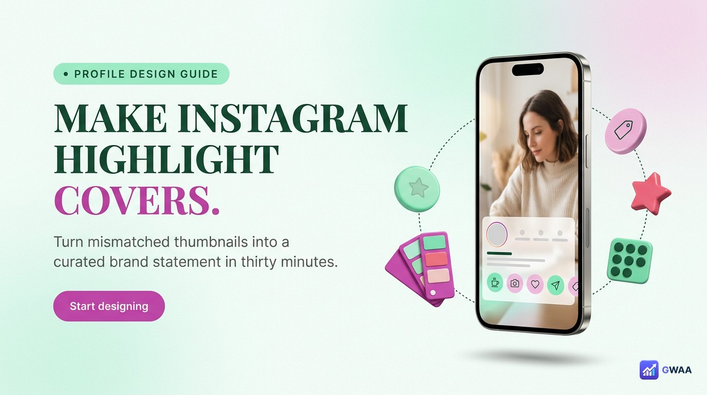
Step 3: standardize covers

The single highest-leverage change for any highlight set: make all covers look like they belong together. This means:
- Same palette. Pick one accent colour (warm amber, cool teal, muted rose, olive green, dusty lavender) and use it across every cover. Background colour stays consistent too.
- Same icon style. If using icons, all minimalist line-art or all filled shapes — never mixed. If using photos, all desaturated to similar tones.
- Same weight. Icon stroke thickness, font weight, sizing — all matched.
- Same proportion. Each icon/image takes up roughly the same percentage of the cover canvas.
Canva templates make this easy — pick one Instagram highlight cover template, then duplicate and swap the icon for each album. The 30 minutes spent here is the most visible "before/after" change on your profile.
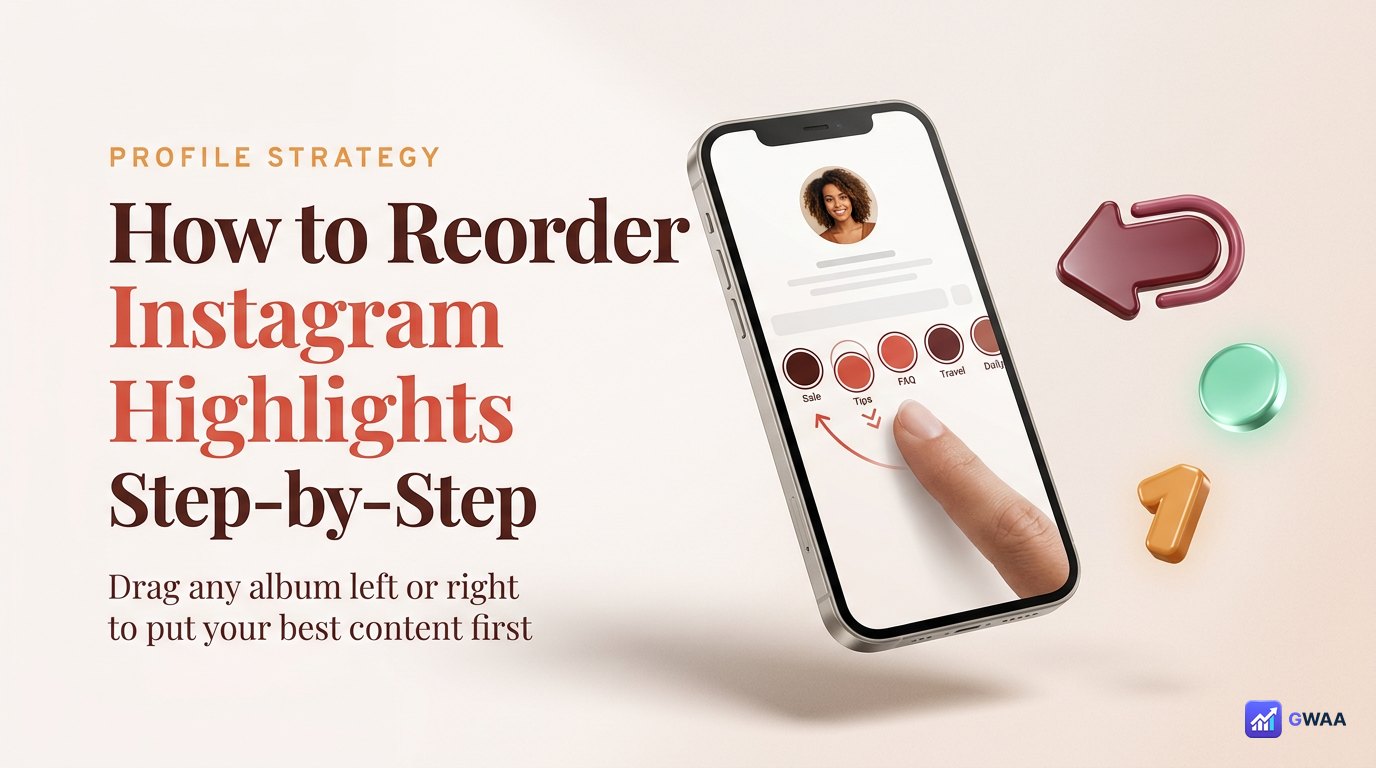
Step 4: reorder by importance

Position matters dramatically. Distribution of highlight views by position (from observation, approximately):
- Position 1: ~40-50% of total highlight views.
- Position 2: ~20%.
- Position 3: ~15%.
- Position 4-6: ~10% combined.
- Position 7+: <5%.
So whatever’s at position 1 does the heavy lifting. Order strategy:
- Position 1: your strongest evergreen content (testimonials, best-of, primary product) — the thing you most want new visitors to see.
- Positions 2-3: high-priority secondary content (FAQ, current promotion).
- Positions 4-6: supporting content (behind-the-scenes, secondary product lines).
- Position 7+: archive and seasonal content people specifically scroll to find.
To reorder: tap and hold any highlight to enter edit mode, then drag covers left or right.
Step 5: trim sparse albums

From your audit, the albums to consider deleting:
- Albums under 3 stories. Too sparse to feel like real content. Either fold them into a richer album or delete.
- Single-event albums that ended. A wedding album from 2 years ago might still belong; a single-day promotion from 2 years ago doesn’t.
- Outdated promotion albums. Whatever campaign ended six months ago without recurring — delete.
- Test or draft albums. Anything you created while figuring out the platform — always delete.
Deletion is reversible (the underlying stories stay in your Archive), so don’t over-think it. Delete now; recreate later if you decide you were wrong.
Step 6: monthly 15-minute review

The system only works if you maintain it. Pick one day per month (first Sunday, last Friday of the month, whatever) and do this 15-minute review:
- 5 minutes: review the past month’s stories in your Archive. Promote the 2-3 best to existing relevant albums.
- 5 minutes: check view counts on existing albums (visible in edit mode for creator/business accounts). Note which are still performing.
- 5 minutes: retire any album that hasn’t been updated in 6+ months and isn’t evergreen. Reorder if needed.
That’s it. 15 minutes × 12 months = 3 hours a year. Less time than most accounts spend deciding what to post in a single day, and your highlights stay current, curated, and effective.
Naming rules for albums

Small details matter for the row’s overall feel:
- Single word when possible. "Travel" beats "My Travels Around The World." Short labels read faster.
- Lowercase for calm tone. "travel" reads more casually than "TRAVEL." Choose intentionally; either works if consistent.
- Same length across albums. Don’t mix "FAQ" with "Behind The Scenes." Either all short or all medium.
- No emoji in labels. 🌴 might feel friendly but it adds visual noise and breaks the typography consistency.
The labels are subtitle-style text under each cover — they’re part of the visual composition, not just metadata. Treat them as design elements.
Common mistakes

Four pitfalls that quietly degrade highlight performance:
- Too many albums (over 15). Beyond 15, visitors can’t scan them all and your best content gets buried. The platform doesn’t reward quantity here.
- Default thumbnails as covers. The auto-generated thumbnail from the first story rarely represents the album well. Custom covers always look more intentional.
- Inconsistent label style. Mixing CAPS with lowercase, mixing emoji-with no-emoji, mixing word lengths — all add up to "this account doesn’t care."
- Never reordering. Your priority changes over time; if your highlight order is the same as when you first set it up two years ago, position 1 probably isn’t your best current content anymore.
When to merge two albums
If your audit shows two albums covering similar themes, consider merging:
- "Pets" + "Dog photos" → one "Pets" album with all dog photos plus any other pet content.
- "Travel 2025" + "Travel 2024" → if both are sparse, merge into "Travel" with recent content first.
- Two promotional albums for the same product line → consolidate into one "Products" album.
To merge: create the new combined album with all stories you want to keep, then delete the old separate albums. The underlying stories stay in your Archive throughout, so nothing is lost.
When to add a new album
Add a new album when one of these is true:
- You have 5+ stories worth pinning that don’t fit any existing theme.
- You’re launching a sustained new content category (not a one-off campaign).
- Your existing albums are getting cluttered with off-theme content that needs a home.
Don’t add a new album for: one-off events, single-day promotions, single creative experiments. Those go into an existing album (if relevant) or stay unpinned (most common case).
Static vs seasonal: pick one and commit
A frequent question: should highlights stay the same all year, or rotate by season? The answer depends on your account type:
- Personal accounts: stay static. The same 6-8 themed albums work indefinitely. No reason to rotate.
- Brand and creator accounts: 70% static + 30% seasonal. Keep your evergreen positions 1-4 unchanged, rotate positions 5-7 for current campaigns or seasonal content.
- Pure campaign accounts (rare): heavy seasonal rotation. New event, new campaign, new highlight set.
Whichever you pick, commit to it. The worst pattern is half-static, half-seasonal where you can’t remember what stays and what changes. Pick the approach, write it down, follow it for 6 months before reconsidering.
Branded vs personal: same method, different content
The six-step method works for both account types — only the content choices differ:
- Personal: step 2 themes tend toward life areas (travel, food, friends, hobbies, milestones).
- Branded: step 2 themes tend toward business categories (products, services, FAQ, customer stories, team, behind-the-scenes).
- Step 3 cover style for personal accounts can be more relaxed (photos, casual icons). For branded accounts, stricter discipline (icon library, brand colours, no photos).
- Step 6 monthly review stays the same — same 15-minute rhythm regardless of account type.
The formula in three numbers

If you remember three numbers from this page: 6-8 albums, 15 minutes per month, 1 palette. That’s the whole organizing system.
The accounts with the cleanest, most professional-looking highlight rows aren’t doing anything magical — they’re just curating to 6-8 albums, maintaining monthly, and keeping the palette consistent. Anyone can do this. Most accounts don’t, which is exactly why doing it makes your profile stand out.
The accounts whose highlight rows feel professional aren’t the most creative ones — they’re the ones following a simple system consistently. Pick the system. Use it for six months. Reassess only after that.
Related guides
- How to make highlight covers — the design layer for step 3.
- How many highlights can you have — the platform limits behind the 6-8 sweet spot.
- Instagram highlights vs stories — format-level differences that drive curation.
- Instagram profile analytics explained — measuring whether organization improves engagement.
- Anonymous viewer playbook — broader tool category context.